Vigilante Design: The Fair Trade Certified label
I tried to describe the logo my mother should look for—a half-black, half-white, double-bucketed asexual figure in front of a 3d globe—and suddenly realized how to better support the Fair Trade movement.
Although inspired by Vigilante Design years ago, I had doubts. Could design really succeed without knowing how the client measures success? It felt too much like spec work. If I hadn't stumbled into trying and failing to aid someone in incorporating Fair Trade into their buying habits, I probably would've left well enough alone.
To be clear: Transfair USA has not asked me to do a redesign of their logo, nor has my fianceé—who works for them—expressed any displeasure in the logo.
By the age of 6, my mother had trained me to look for the upside-down Spidey in the corner of comic books. If he wasn't there, I couldn't buy the comic. Decades later, I discovered that Spidey did not represent any actual certification scheme, just a way to keep me away from Punisher, G.I. Joe, or anything with guns. In the big picture of changing buyer behavior, the logo is less important than value propositions, availability, or even habit, but that doesn't excuse us as designers for not doing what we can to help consumers recall, recognize, and recommend the Fair Trade Certified label.
The problem to be solved
A good logo needs distinct shape and character. It doesn't have to tell the whole story of your brand, just serve as a conceptual container for what the brand may ultimately deliver. The Nike logo doesn't mention shoes (smart since they've moved far beyond shoes) but the checkmark does evoke accomplishment. Similarly, the Apple logo doesn't mention computers but a bite from the forbidden fruit well conveys their iconoclasm.
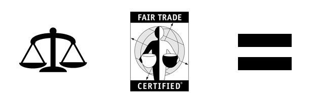
As for shape, the current Fair Trade Certified label may not hold up to the Nikes or Apples of the world but still has a lot going for it. When we consider imagery associated with fairness, justice, or equality the first that springs to mind is the scales, closely followed by an "equals" sign. Both are embedded, although understated.
Accentuated instead is the laborer's half-white, half-black aspect, a juxtaposition I assume is meant to represent race? A single-color silhouette (either black or white) would represent humanity in its totality, but a two-color makes the contrast undeniable. Before I understood Fair Trade as a concept, I thought this meant that trade between different nations should be without deficits. Ignoring the symbolic confusion, it also confuses the overall shape.
The globe underlines the global nature of cocoa from Ghana ending up in Switzerland or sugar from Paraguay ending up in the United States. It may offer a typical consumer some insight into supply chains ("my food comes from somewhere?") but it seems redundant for consumers already looking to buy Fair Trade. Regardless, it confuses the overall shape just like the bi-racial protagonist.
As for character, the lines are thin, mostly straight, and the grid of the globe has a technical feel to it. While the main figure has a noble posture, his or her lanky build doesn't impart happy or healthy.
Constraints & considerations
Let's not do this in a vacuum, eh? We'll first download the label usage guidelinesand learn the flexibility the label requires. Next, let's take a look at the existing landscape of certification logos.
Transfair USA certifies a lot of different products, but coffee remains what they're best known for. The ooviest of grooviest coffee-makers will "triple certify" their beans. "Triple" means Fair Trade, Organic, and Shade Grown (typically certified through Rainforest Alliance). Unfortunately, not every coffee-maker falls into this oovy-groovy (OG) category and many certify with only one scheme. A consumer in a hurry, despite wanting to do right by both his or her own family and the family growing their food, might be content with coffee certified by somebody, even if it's not Fair Trade. This (quite tragically!) introduces competition among schemes.
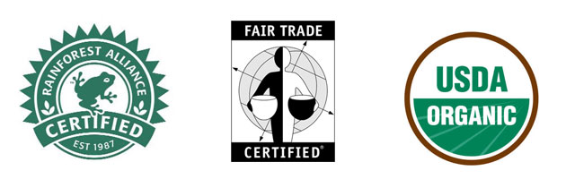
The Rainforest Alliance logo is fun, interesting, and easy to recommend (I could've just told my mom to look for the frog). The USDA Organic logo, while a little boring, is easy to recognize. Unfortunately, when we're actually shopping, the labels of certification schemes that a product carries—not to mention nutritional information, ingredients, or even weight or volume—are tiny and hard-to-read.

Here are those same logos at half the size and blurred to simulate our quickly scanning a shelf of products. The frog, like his real-life counterparts, disappears into a mass of green. We're left with two colored circles and a black & white rectangle. Fair Trade Certified wins this round; in fact, a "black & white rectangle" is what I actually scan for when shopping for Fair Trade...
Unless I'm in Europe. Fairtrade has a different logo everywhere else in the world. The United States decided to be different (surprised?). The minimalist in me really, really wants to just recommend the U.S. adopt the global brand.
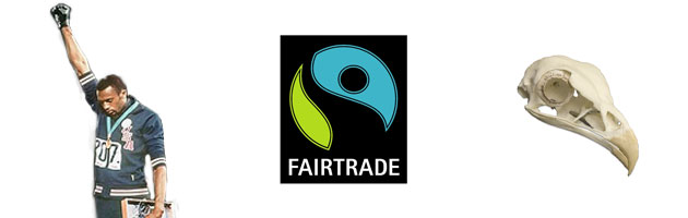
Unfortunately, it's not a terribly great logo. Nice colors, but in terms of shape it's meant to convey either a laborer with fist in the air, a dead bird skull (ONCE YOU SEE IT YOU CAN'T UNSEE IT), or... uh... I dunno, maybe a coastal highway during a solar eclipse? Anyway, I'm unimpressed.
Chiseling away inessentials
Bruce Lee, in describing logo design:
The extraordinary aspect of [logo design] lies in its simplicity. The easy way is also the right way; the closer to the true way of [logo design], the less wastage of expression there is.In building a statue, a sculptor doesn't keep adding clay to his subject. Actually, he keeps chiseling away at the inessentials until the truth of its creation is revealed without obstructions.
Okay, so he's talking about martial arts and not logo design but the same principles hold.
The parts of the current Fair Trade Certified label that work are the colors (black and white stands out) and the vague association with the scales of justice. The parts that don't are the bi-racial aspect of the main figure and the confusing background. Let's keep the good and drop the bad.

We immediately increase legibility in the small and fuzzy version versus the original. It still retains its shape as both a human figure and a set of scales. The character is round and friendly, the buckets break the border—suggesting abundance and generosity.
Without a client to require additional constraints and considerations, I have to admit this process feels empty. Excellence comes from the dance of wild intuition and callous evaluation. What do you think? A successful redesign or no forward motion? Does it accidentally resemble anything?