Saying Goodbye to Superbowl Logos
The NFL has announced that this year will be the last time they redesign the Superbowl logo. After over forty years of wild mutations and embarrassing zeitgeists, it's finally been standardized. Let's say goodbye to some old gems.
My friends were split right down the middle on Colts vs. Saints, but I think we can all agree that the NFL's plans to keep the new Superbowl logo the same year after year will deny generations to come the ability to say, "Shiny VAG Rounded and a Reflection? What were they thinking?"
Some of my favorites of yesteryear, complete with accompanying snark, below.
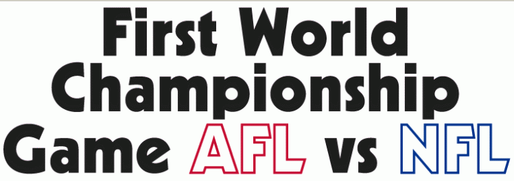
1966. The first Superbowl wasn't a Superbowl at all. Very sporting of us to hold a "world championship" for a game only played in one country. Still, I can't imagine how such a logo was approved during Don Draper's 1960s.
1970. This one looks like The Future, or what The Future must have looked like in 1970 back when flying cars seemed right around the corner. The curved multiple lines are very IBM.
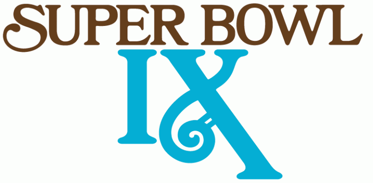
1974. A typographically interesting specimen; the curvy "X" is most unexpected and vaguely feminine for the manliest manfest in sports. It reminds me of a yearbook or a Carpenters album cover. I bet the designer got canned that year.
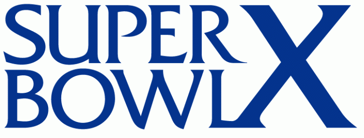
1975. But the very next year, something just as fonty. That's the legendary Friz Quadrata, by the way, none to the masses as "the Law & Order font". Also, back in 1975 the letter "X" must not have been as incredibly badaXX as it is nowadays or it would appear bolder. Or maybe the standards for what qualifies as "bold" have changed.
1981. This one just screams Wrath of Khan to me. No?
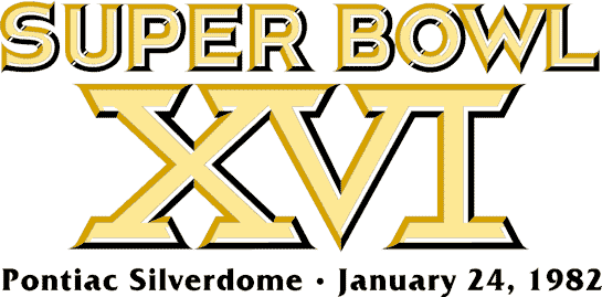
It's worth noting that the slab-serif-plus-bezel style of the Roman numerals would be hard to shake for the next few decades.
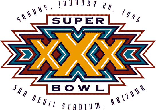
1995. Peculiarly southwestern. Yes, it was in Arizona but I have to assume that—tame as the Mid-Nineties were—it was a deliberate decision not to play up the XXX theme. I could imagine a logo adorned with neon mudflap girls going over with the Nascar crowd.
2008. What are the chances this just so happens to so closely resemble the Obama logo of that same year? Why didn't I notice that the first time?
You can see all of the old Superbowl logos here. What's your favorite?